As UI designer, I redesigned the local sushi restaurant website.
This project spanned over 3 months as a part of the Interaction Design Foundation UI Design course, delivering UX and UI design, stylesheet, low and high fidelity wireframes, high fidelity mockup, prototyping, design system and user testing.
Aki is a local Sushi restaurant that offers both dine-in and take out.
Take out order became more popular than ever since the covid outbreak.
Having visual and user friendly design is a key to attract existing and potential future customers.
Without them, customers would leave the site immediately and probably never come back. Even if they stay to place an order, the negative experience will affect their future behavior.
- Click a box to jump to each process -
It might seem that everyone is interested in the same thing: simply order good sushi… but upon closer inspection, it turned out that there were divergent motivations.
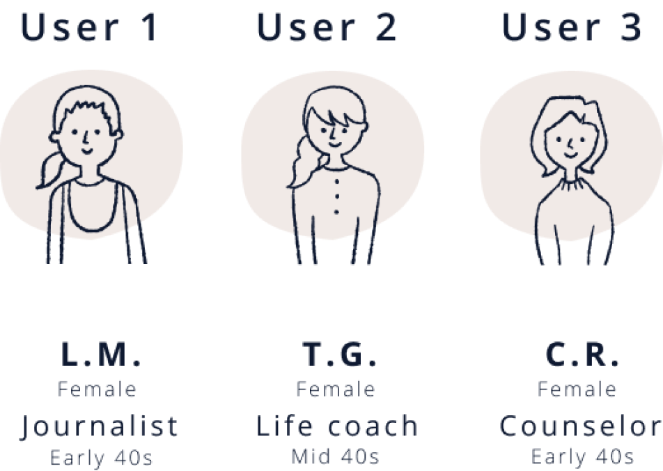
Understanding personas helped bring some clarity to those divergences, which would become important reference points as functions developed.
As research and design proceeded,
I focused primarily on two personas because they represented heavy emphasis of two key functions: ordering online and ordering by phone; and reliance on the app’s browse, search, and filter functions for viewing choices.
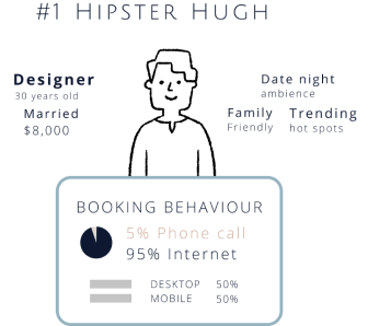
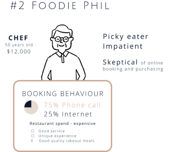
By exploring the characteristics of two personas and their typical tasks, I uncovered key emotional/procedural moments that Aki Sushi restaurant website needed to address. The anxiety someone might feel, for example, if they’re not comfortable with ordering something online. Providing intuitive and joyful online order experience is not always the only solution for some users. To ensure all users’ needs, it would need to overcome these problems.
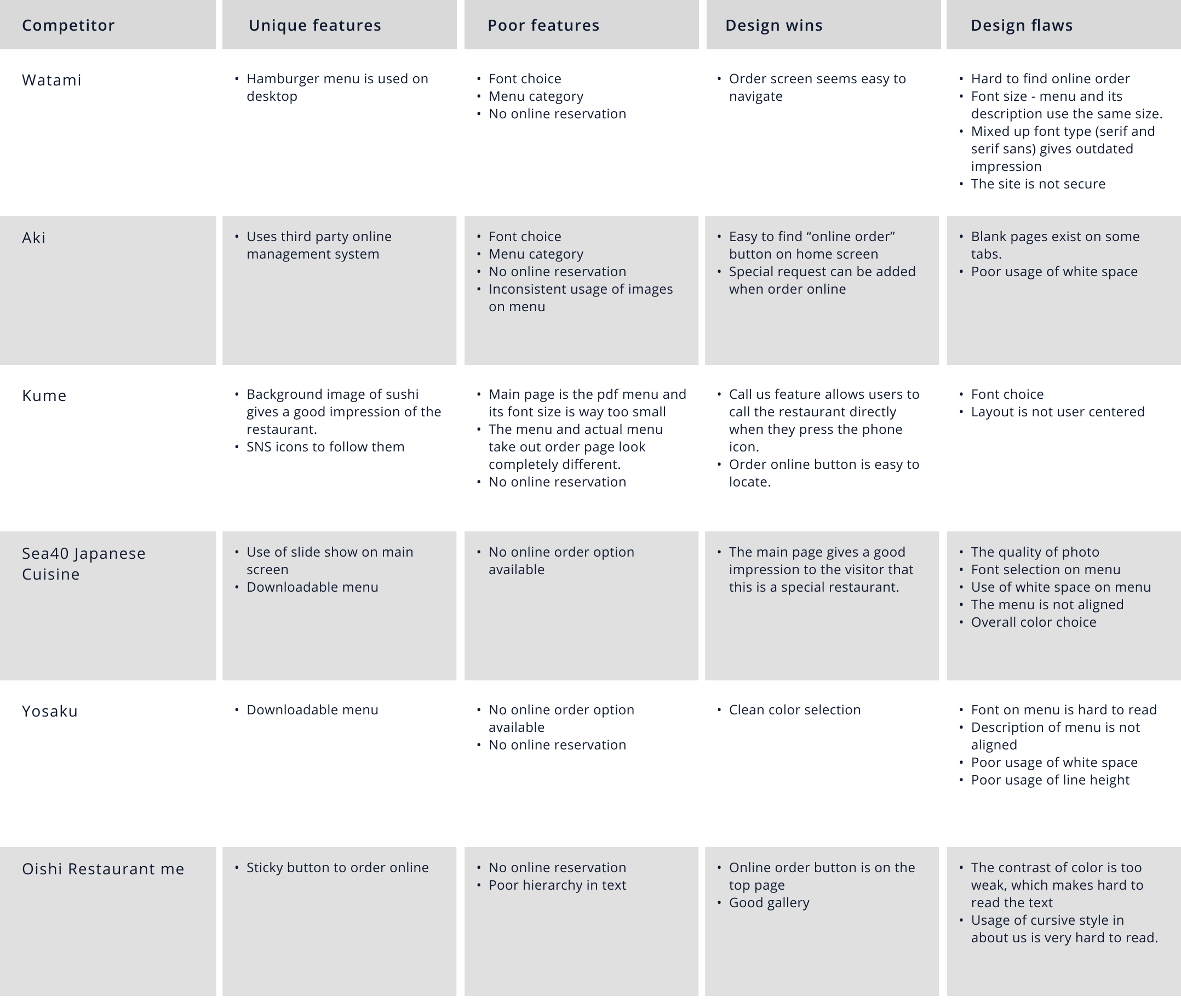
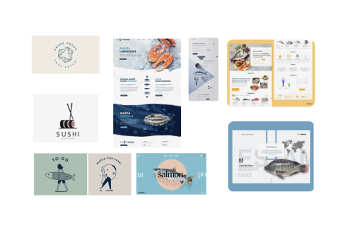
My research first centered around the competition space in order to understand how other sushi restaurants are addressing similar issues.
I picked five sushi restaurants websites nearby for competitive analysis and identified unique feature, poor/irrevant feature, design wins and design flaws.
Some competitors had good design features such as sticky button to start the order or usage of impressive hero image to give positive impression to users.
In majority of the pages, finding the right page to accomplish the task was an issue. For instance, it’s not always easy to simply find a button to start the order, or look at the menu.
As a next step, I conducted UI audit of the current site and chose eight screens for evaluation - home, order top page, about us page, menu top, order pop up screen, mobile home and shopping cart. I evaluated each page with The 10 Nielsen-Molich heuristics and listed up the problems, categorized those in themes and came up with solutions for each.
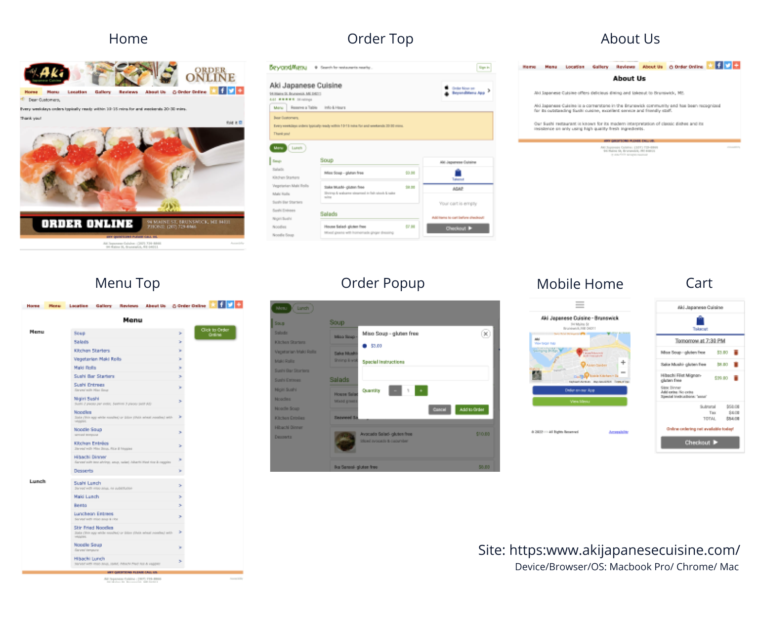


Violations and problems found from heuristic evaluation and screenshot analysis need to be corrected for more user-centered design. I have sorted out all violations and problems, categorized them by themes and come up with the solutions for each theme.
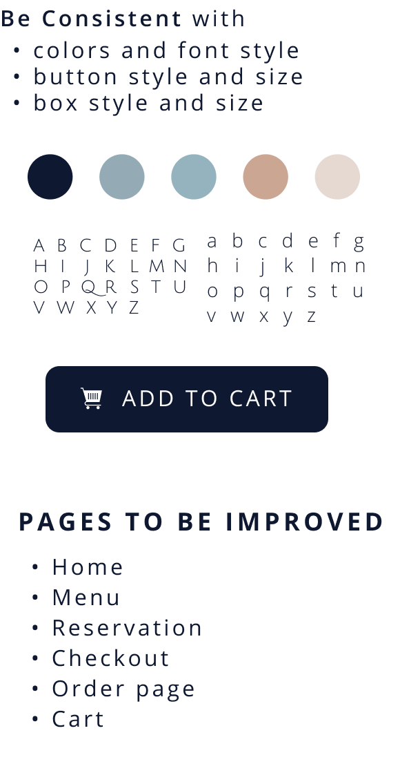
Theme #1
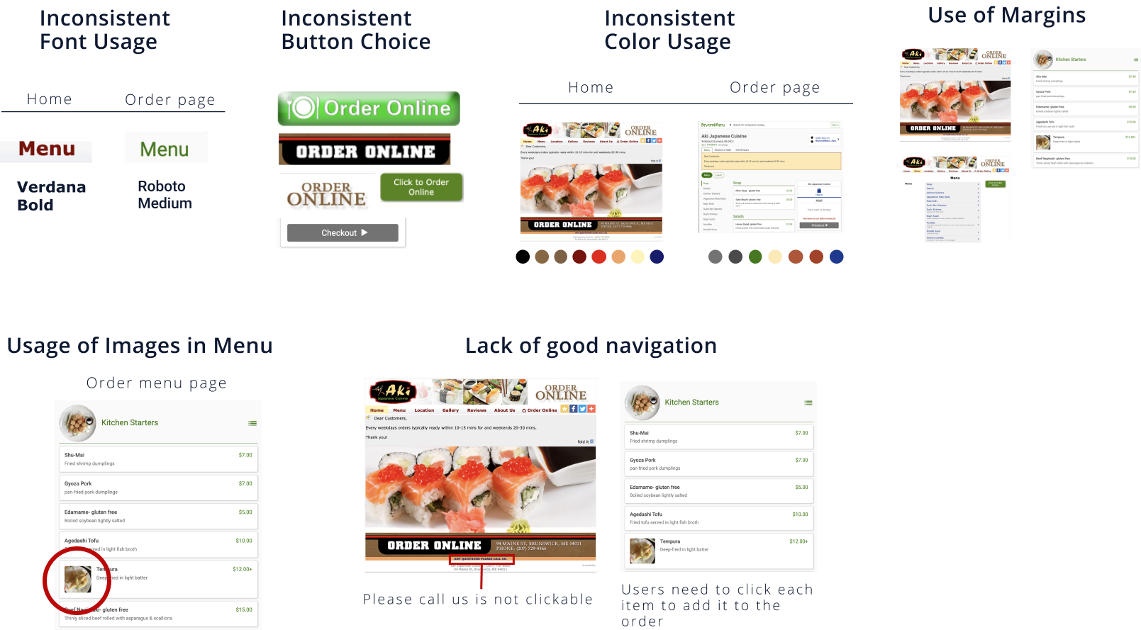
Inconsistent Design
Solution
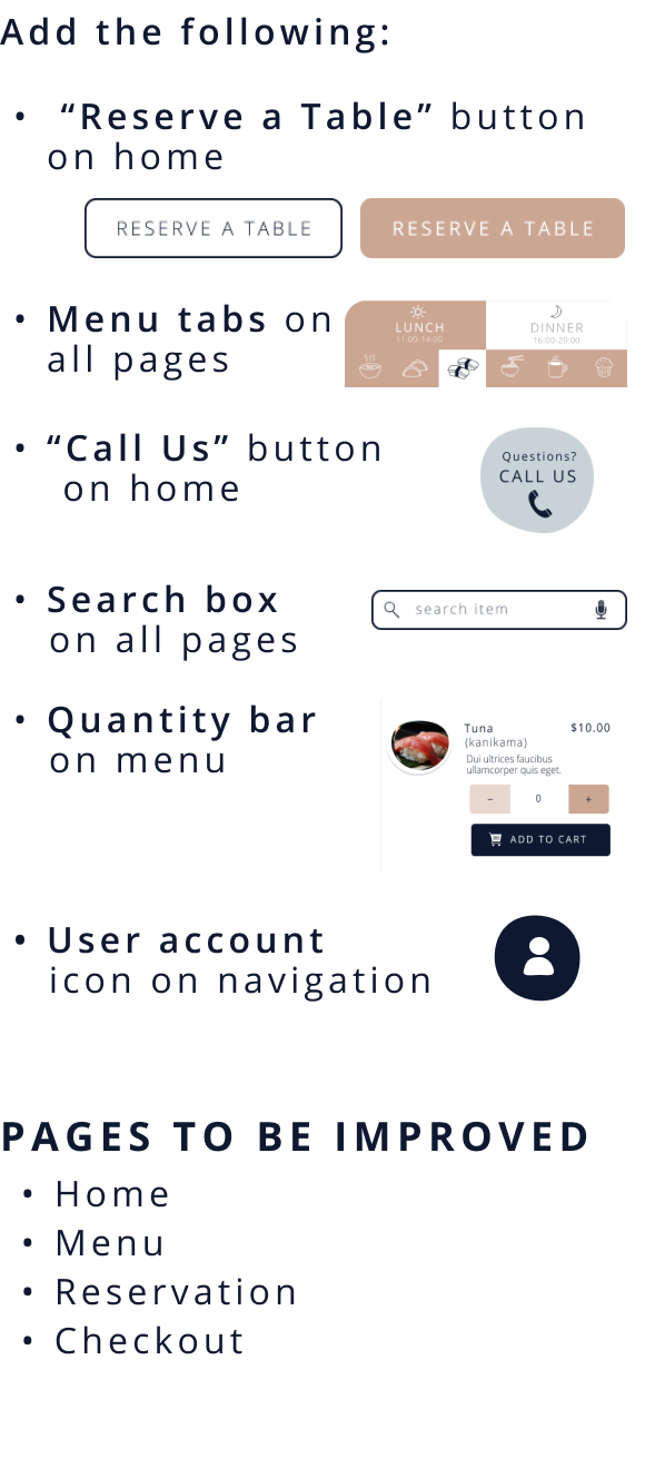
Theme #2
Lack of Navigation
Solution
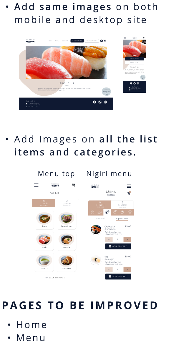
Theme #3
Lack of Visual Images
Solution
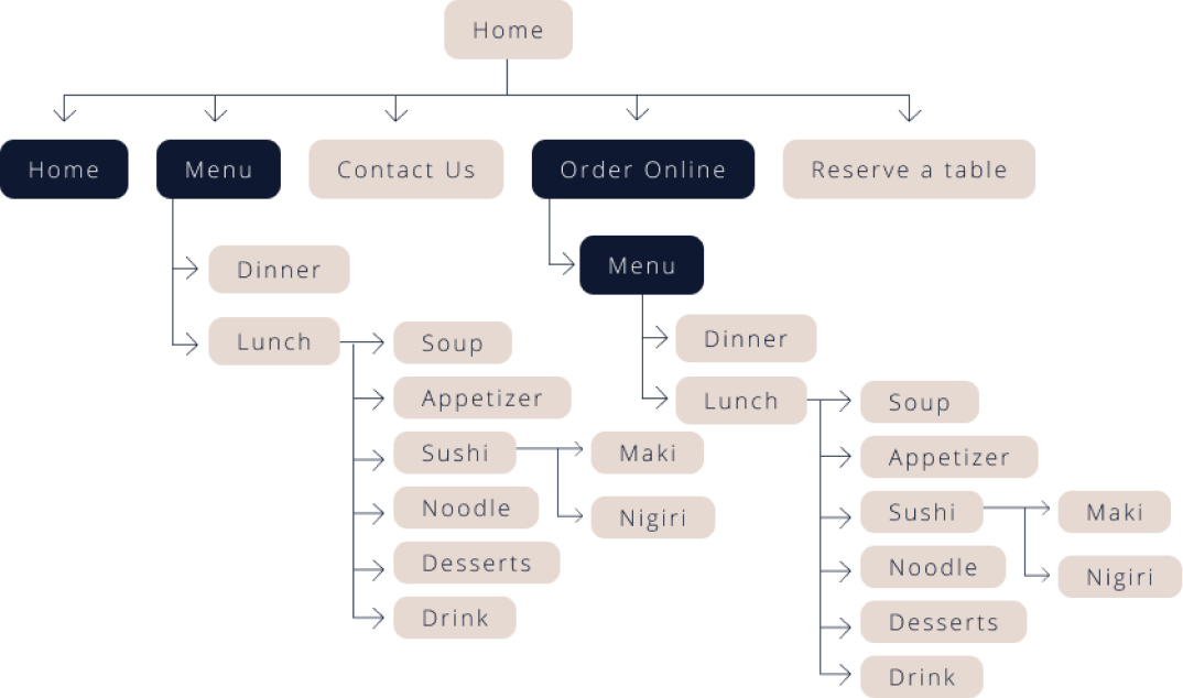
Next, I analized the current sitemap to optimize navigation, map the user experience, and determine page hierarchies. It helped me to identify gaps in content or accelerate the design process.
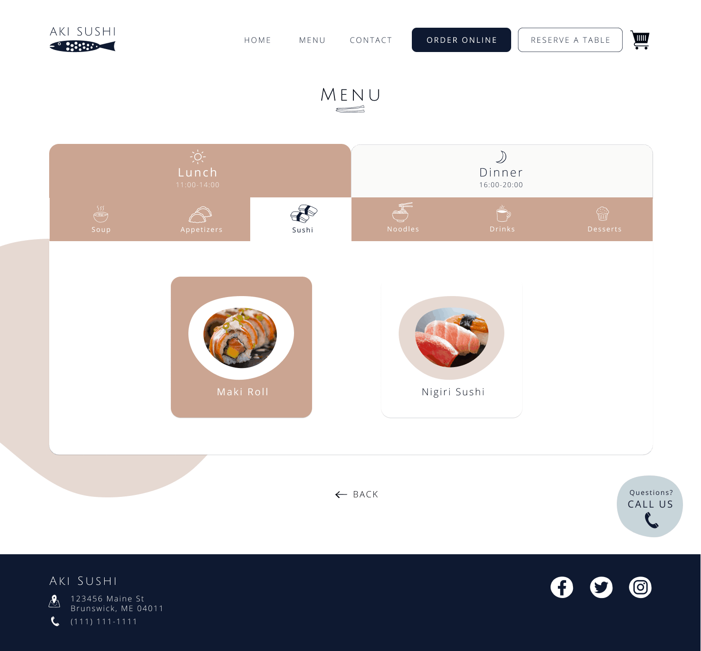
Current site has three major issues: 1. Too many top menu categories. 2. Too many similar categories are on top menu. Some similar categories (example: Noodle and Noodle soup) need to be under same main category, such as Noodle. 3. Reserve a table needs to be on the top menu rather than under order online.
Based on the findings, I changed the sitemap: Simplifying the navigation, adding reserve a table and contact us on top menu, and simplifying the menu.
Thus, I organizationally depicted the three key tasks that the high fidelity prototype would focus on: 1. home, 2. top menu and sushi menu, 3. online order and reservation and 4. cart. The framework the site map provides would guide design decisions moving forward.
Current Sitemap
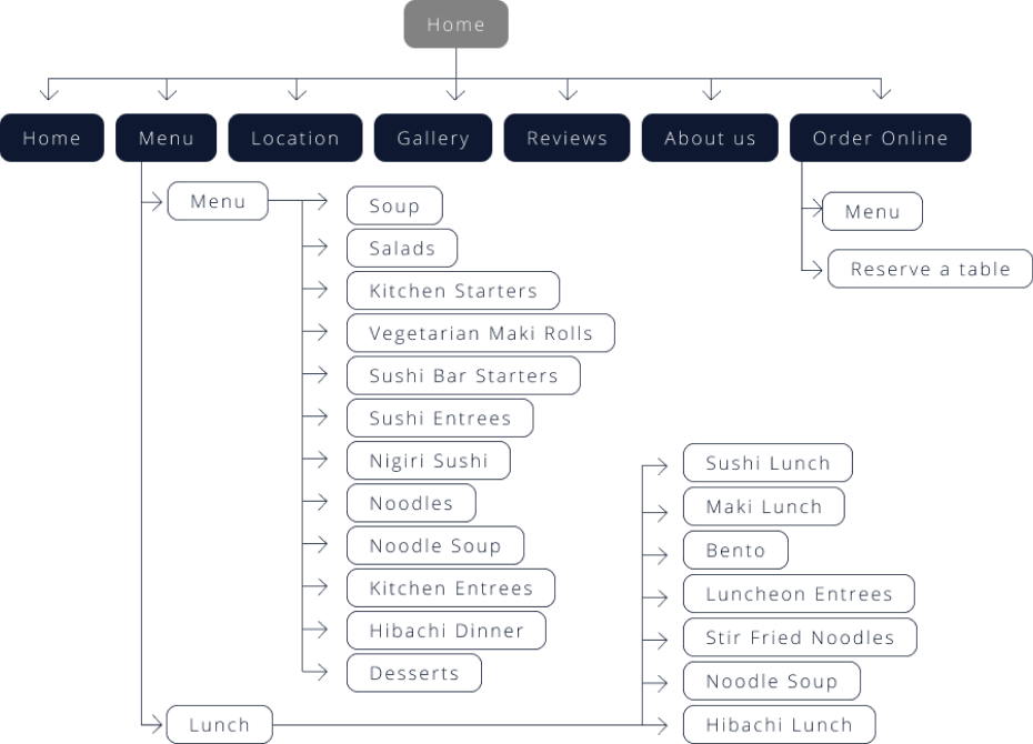
New Sitemap
Rapid sketching allowed me to explore common design patterns in the competitive landscape, helping me understand which needed to carry over into Aki’s website to ensure familiarity.
This also helped me identify screen types that would likely be the most intuitive.
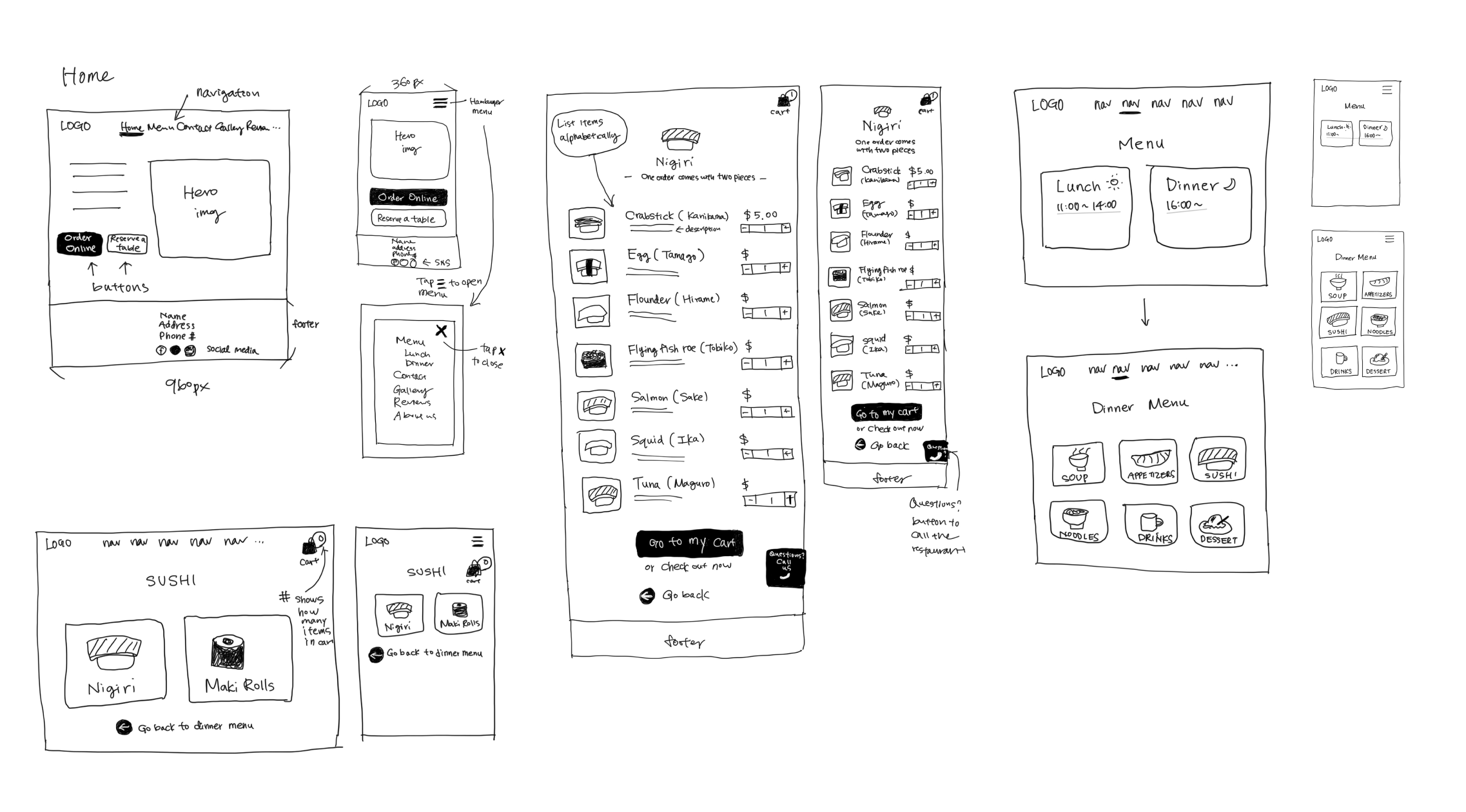
Then I created a wireframe based on the sketch. Creating a wireframe allowed me to better understand how users are expected to complete the tasks I was focusing on and figure out adjustments that needed to be made to lay the foundation for a more fully realized high fidelity prototype.
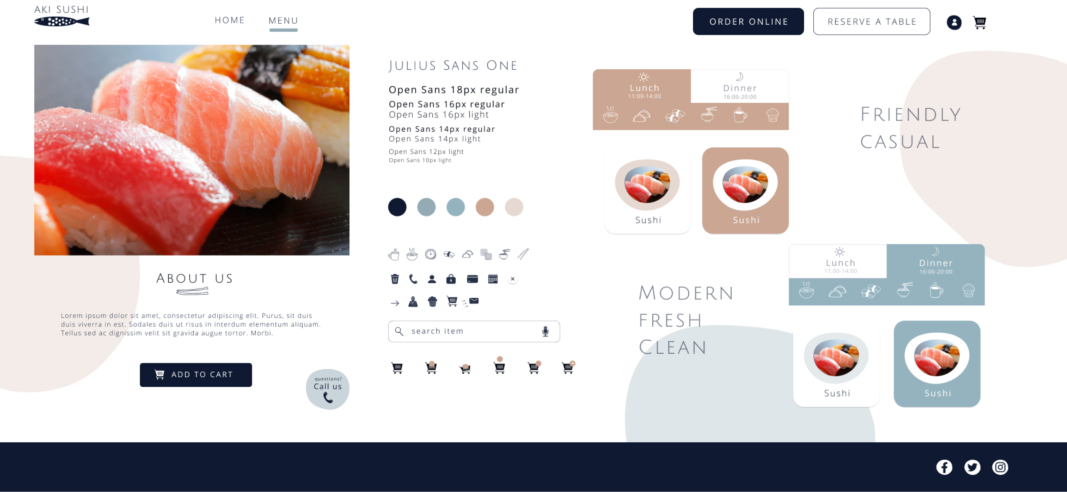
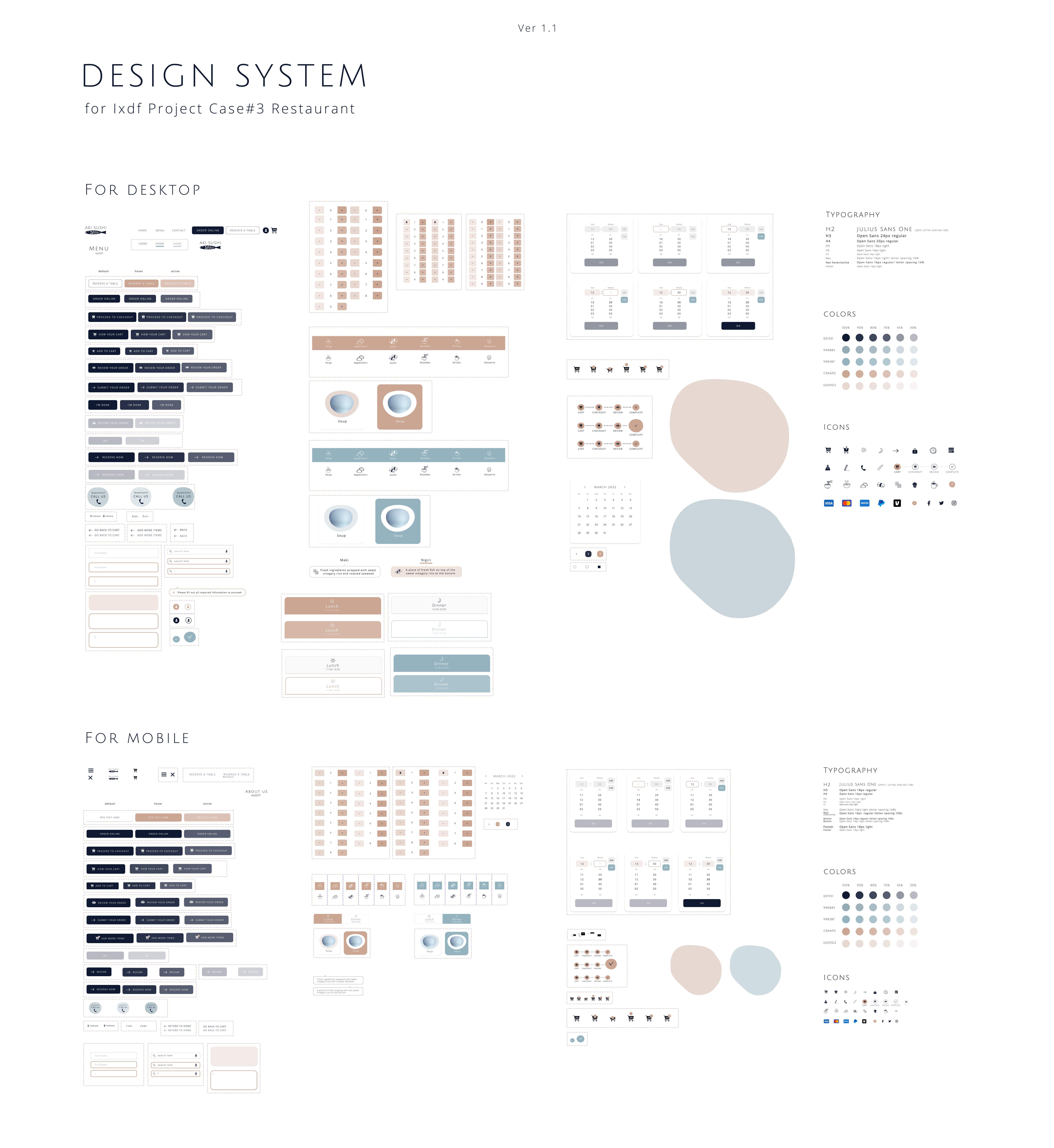
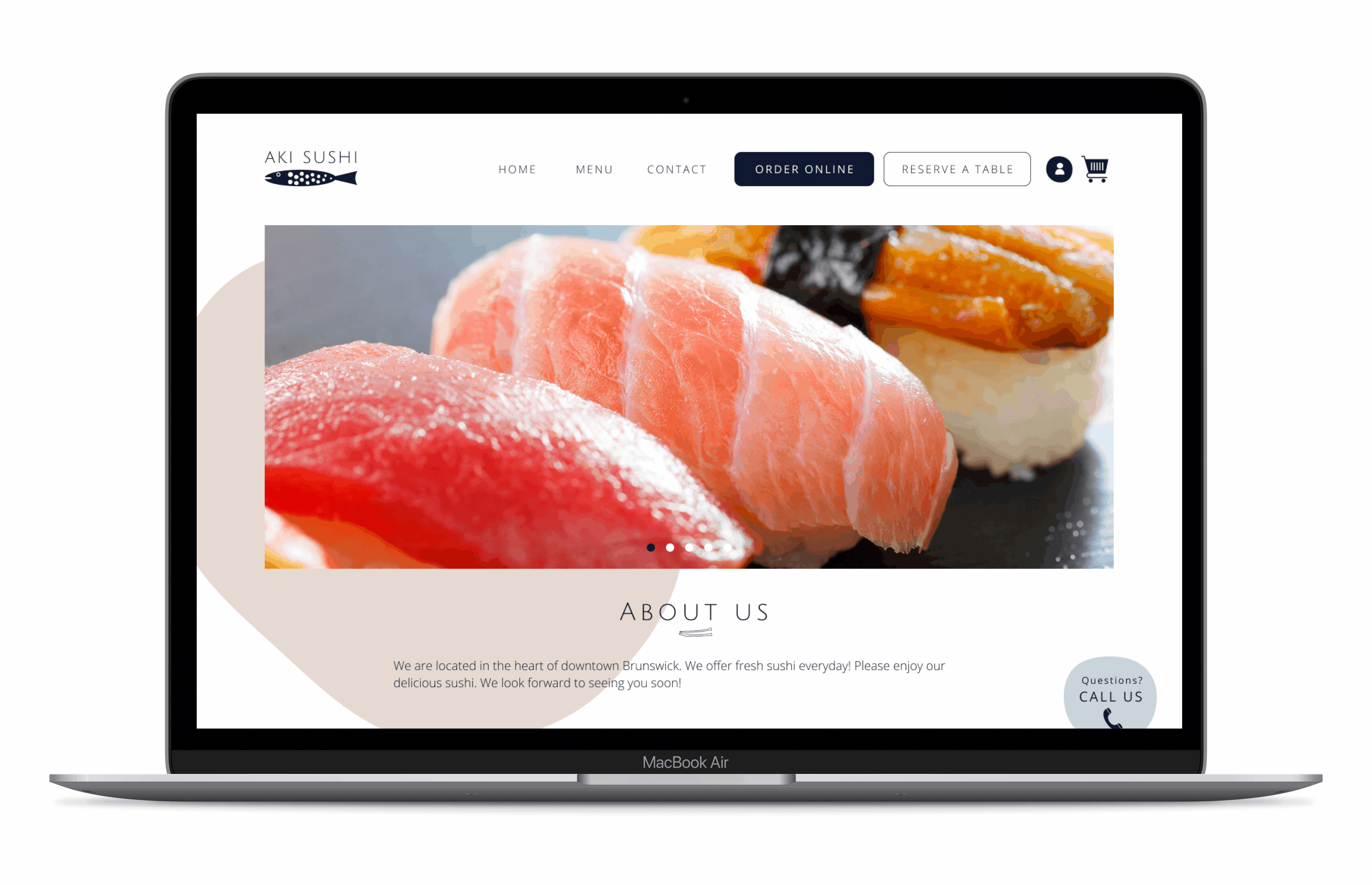
Next, I started to work on the stylesheet. I wanted Aki Restaurant’s visual design to always refer back to who they are and what they offer: clean, modern, warm and sophisticated vibe to customers. I made sure that all the fonts and colors reflect those vibes to the website.
I took several processes to create stylesheet: creating moodboard, choosing typography, colors, images, icons, and creating animations. Then finally I put all together to create the stylesheet.
Process #1
Moodboard
I collected lots of screens for inspirations and I created a mood board that could match with the idea I was thinking about.
Why?
By creating moodboard, I get an inspiration to visualize my idea for this project.
Process #2
Typography
I chose Julius Sans One for heading, Open Sans for paragraph and link.
Why?
Julius Sans One has a modern and sophisoticated impression. Open Sans has great readability to be used for paragraph. Extra letter spacing is added to have more modern and sophisticated vibe to it.
Process #3
Colors
I picked the main colors - navy, white, teal and salmon pink.

Why?
Colors give users various impression. Navy for trust, white for clean, teal for cool and freshness, salmon pink for inviting, appetizing. I set satulation level low for salmon pink and teal to present more modern and sophisticated vibes.
Process #4
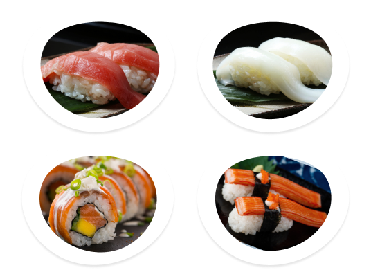
Images
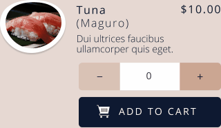
Images are critical. I picked clean, flesh, and delicious images and added a style.
Why?
Poor presentations will give users only negative impressions. Users may find the business even suspicious if the images were not professional and they could possibly leave the website because of poor presentations.
Process #5
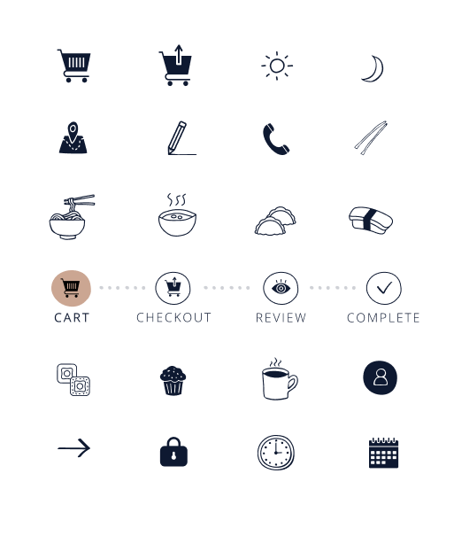
Icons
I chose hand drawn style icons as they have not only casual, and friendly vibes but also have modern vibes. This was perfect to make the impression of the site warm and friendly, but not too sophisticated.
Process #6
Animations
I created a cart animation to make the shopping experience more realistic and joyful. More importantly, using this animation is to ensure the users action, which is adding the item to the cart, is complete.
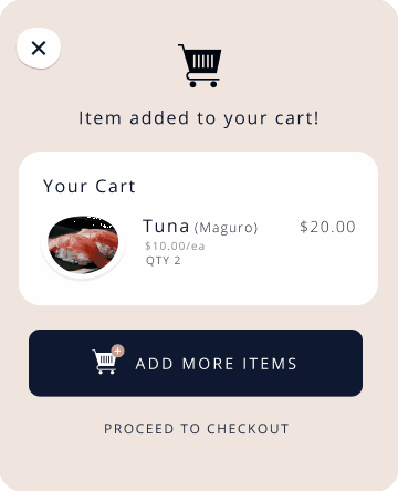
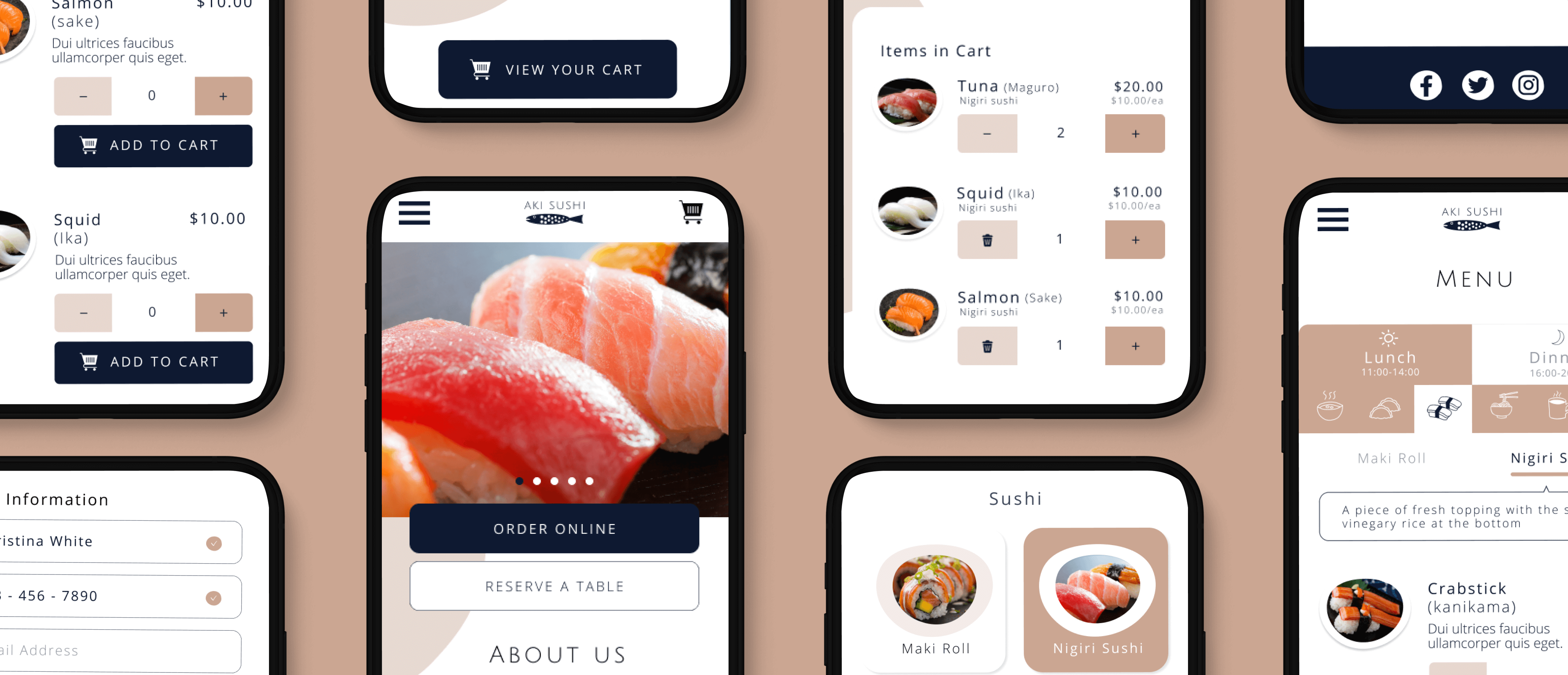
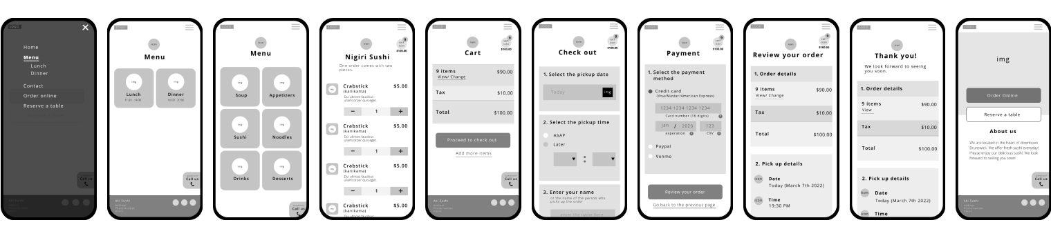
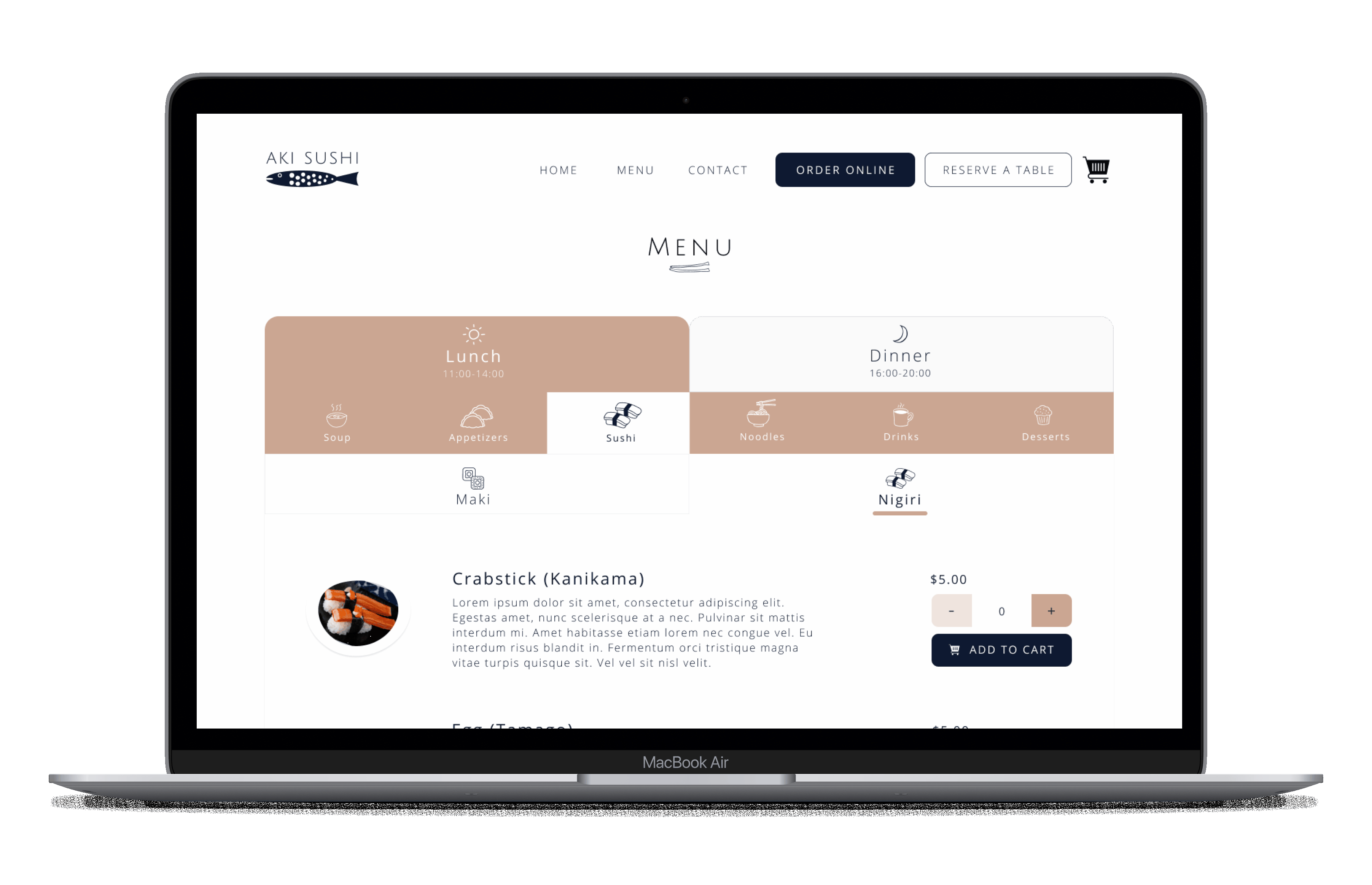
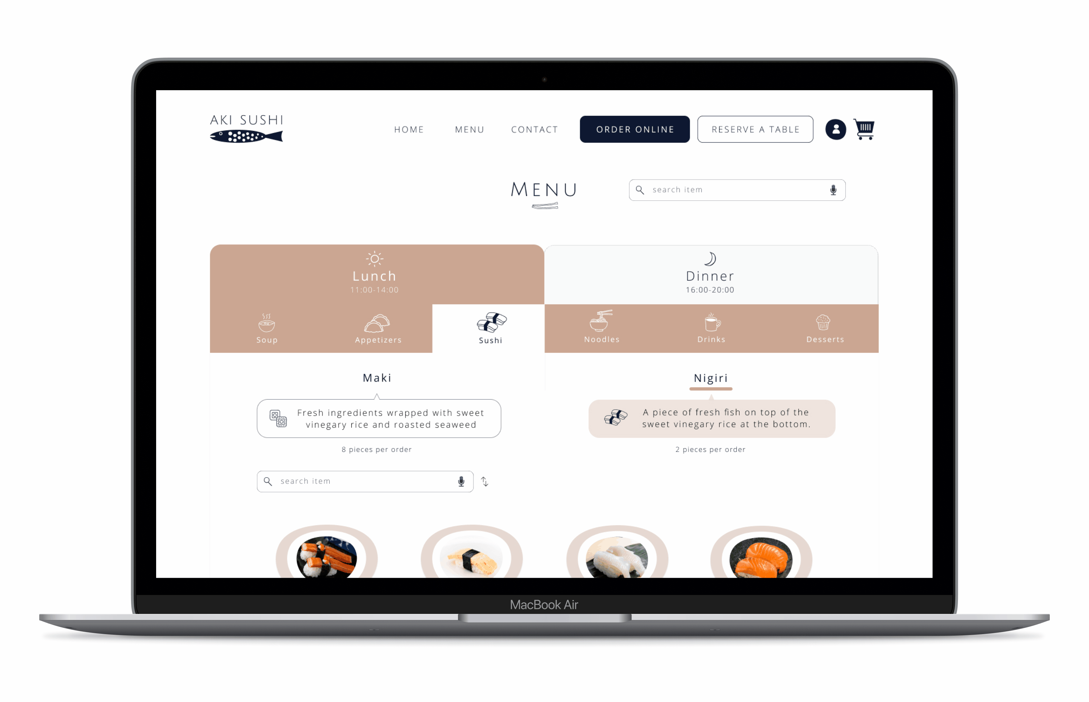
High Fidelity mockup and prototyping allowed me to understand how users actually complete the tasks I was focusing on. I have created both desktop and mobile version of prototype. I paid close attention to small details such as actionable and consistent iconography, and consistent paths to get back, because it would become important elements of the design system. I have used animations for adding item to the cart so users would feel intuitively the task is accomplished.
Figma links for high fidelity mockup is available to view.
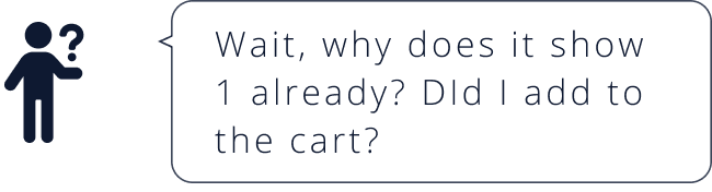
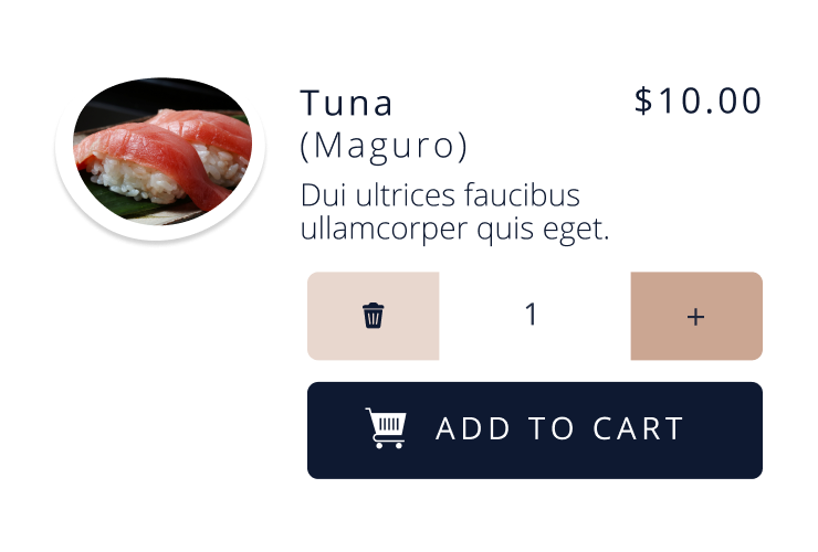
I recruited three users to test the prototype to see how they complete the task - placing an online order with 2 orders of Tuna,1 order of Squid and 1 orderof Salmon with specific pickup date and time and payment method. Usability testing was conducted via Zoom and was recorded. I closely monitored how each user completes the task.
By studying their facial expressions, touch and swipe gestures, I have figured out some unexpected design flaws.
Once the test is complete, I sorted out all the findings and analized the problems I encountered.
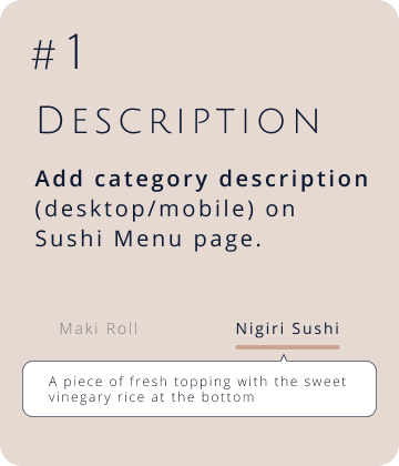
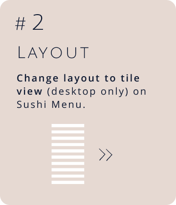
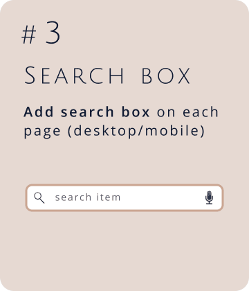
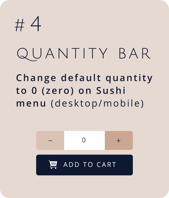
All the identified problems above in usability testing were major design flaws. Those made user either stop their action or look up what they need. In order to be more intuitive, I came up with the following solutions.
Since I created the stylesheet, I have continued to manage the design system for both desktop and mobile version. As a final step, I made sure if all components are there and organized them so the final hand off goes smoothly.
* When you click the link, new window will open.
Now user-centered, intuitive and visually pleasant website that offers online takeout order and reservation is ready to go.

* When you click the button, a new window will open.
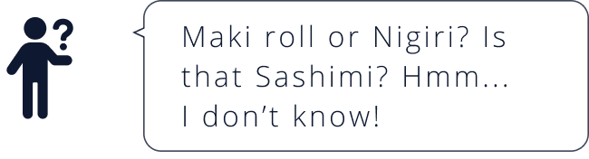
The current website is not accounting for frustrating individual who is not familiar with the cuisine, or for those without digital access.
As a result, many would find the online order process frustrating and/or difficult, despite constantly trying.
By understanding who the users are, and why they were having problems, I was able to reimagine a making online order and reservation experience that helped them find information quickly, and make reservation or place an online order more easily and plesantly.
The relative importance of the information they sought and pain points in the order placing process came through in the research and testing.

People can give up on any websites because of its inability to make reservations or online orders in intuitive, quick and simple.

Users expressed concern about knowing where they were in the online order process, as well as clarifying vague terms they didn’t understand. Simple and intuitive phrasing with a brief explanation was critical to getting users to their online orders more quickly.